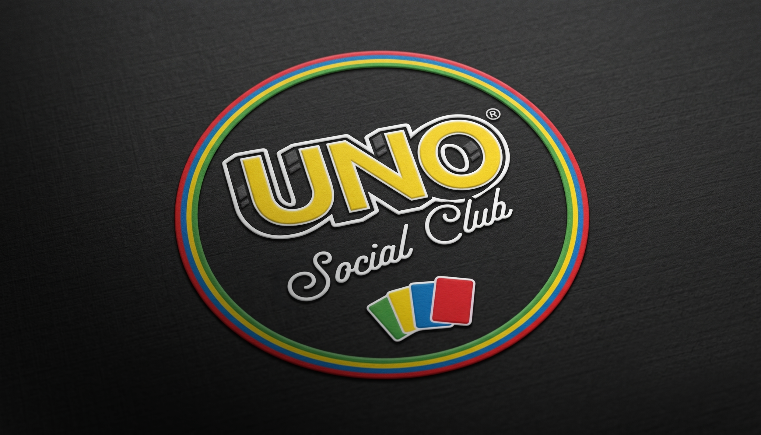
Building on the visual language of the original UNO Social Clubs and the iconic game itself, we refined the identity into a scalable system that could adapt across venues, formats, and cultures. Bold typography, familiar game mechanics, playful compositions, and a deliberately kitschy tone gave the brand a personality that felt energetic, recognizable, and never too serious.
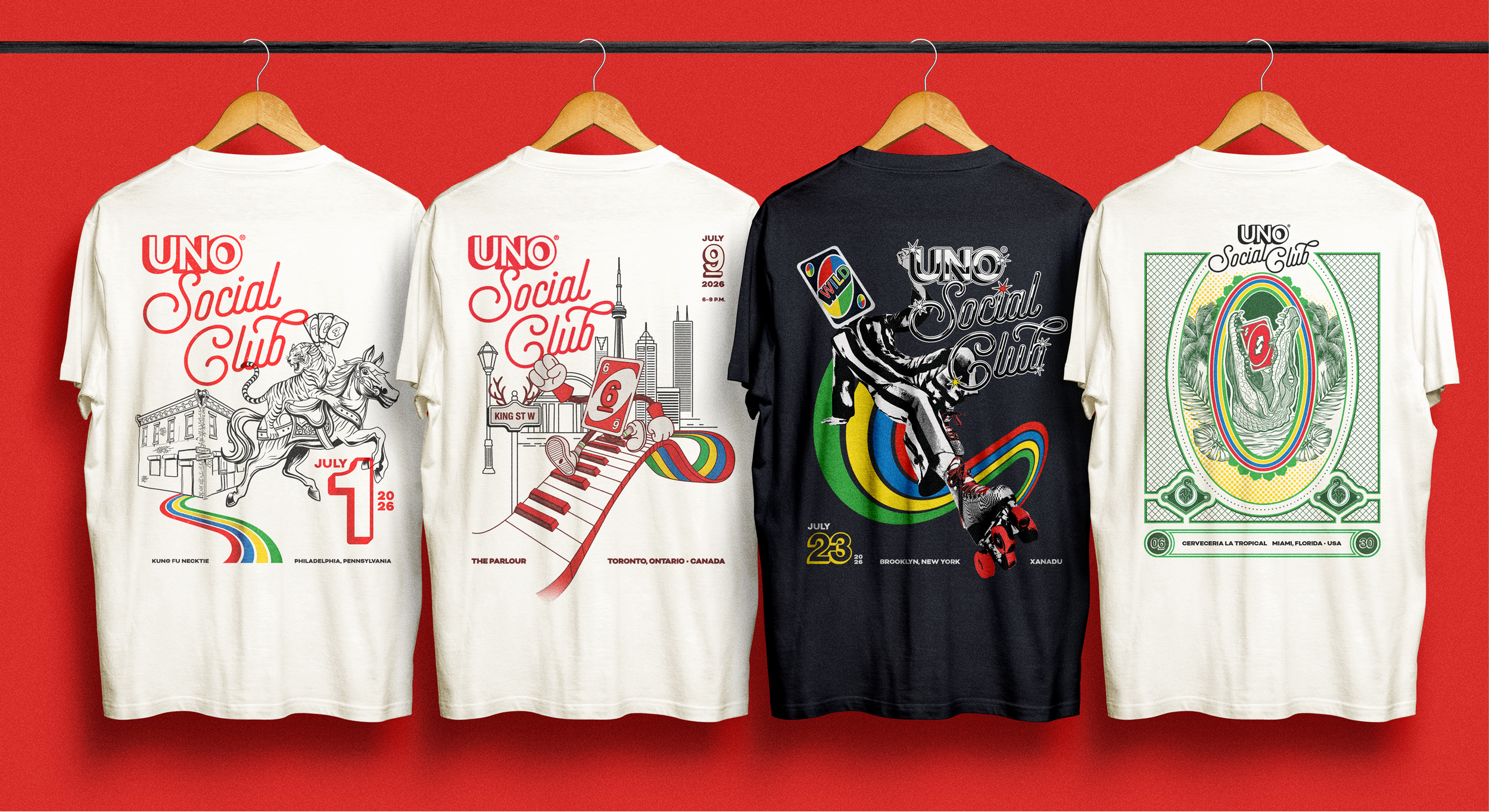
For each stop on the global tour, we expanded the system with custom illustrations and graphics inspired by the local city and venue. From Brooklyn to Tokyo and everywhere in between, every execution combined regional references with unmistakable elements from the UNO universe.
These localized designs extended into posters, apparel, and other event merchandise, turning each tour stop into its own collectible moment. Together, they created a global identity that remained consistent at its core while giving every UNO Social Club a character all its own.